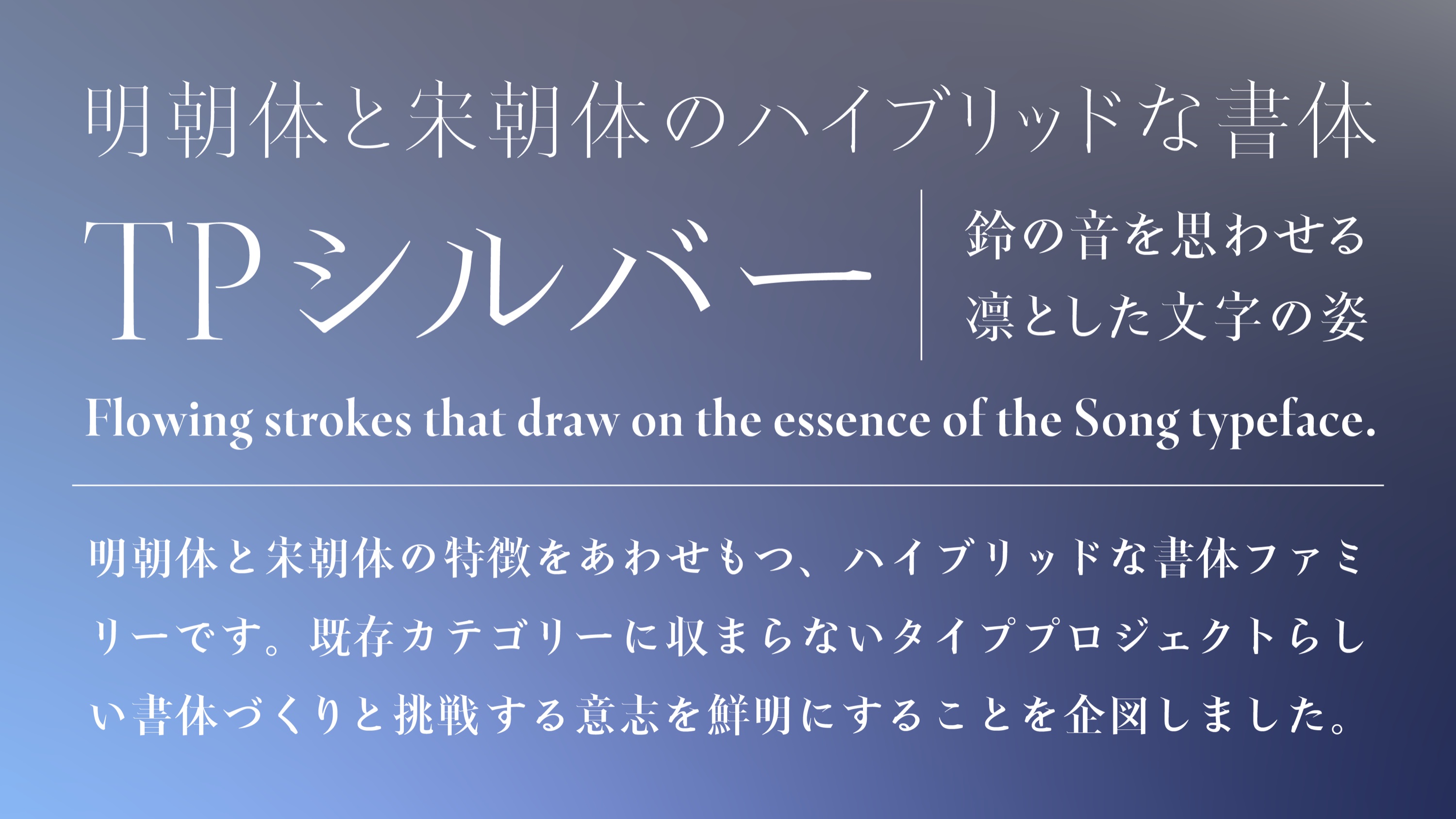
In Japan, as in the West, the serif has a default. For more than a century, Japanese books, newspapers and signs have relied on Mincho, the high-contrast style that grew out of Ming-era Chinese printing. Its names are confusing. What Chinese printers call Songti, "Song type", is broadly what Japan calls Mincho. In Japan, "Song style" (sōchōtai) means something else: a narrower, more calligraphic face that leans its horizontals upward. It is closer to the Chinese Fangsong and is used far less than Mincho.
Thus, when Type Project announces a family that "combines Mincho and Song", it is crossing the country's most common serif with one of its rarer cousins. The Tokyo foundry released TP Silver on 9 November 2026 and named it after its 25th anniversary. In the release, its CEO Isao Suzuki says it answers a plain need: there are few serifs that can stand in for Mincho.
So the central question is simple: is TP Silver a real alternative to Mincho, or a Mincho with sharper edges?
A Mincho skeleton with Song reflexes
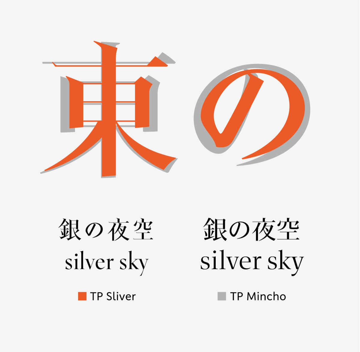
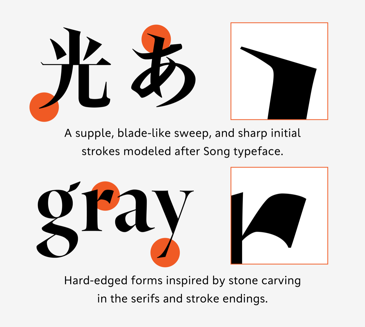
Let's start with what Type Project says it did. As a Mincho hybrid, TP Silver starts from the Mincho logic: thick verticals, fine horizontals, the small triangular uroko at the ends of strokes. It then borrows three habits from Song-style type. The strokes are long and stiff. The hooks and sweeping strokes are strong. And the strokes entering from the left start with a sharp attack. The foundry calls this left-hand entry the family's signature. It compares the hooks to a blade, and the whole design to "the ring of a small bell".
Of course, the interesting part is what Type Project did not borrow. The best-known Japanese Song faces, such as Shigeki Ishii's narrow Song for Tsuda Sanseido from 1959, are around 70% of the body wide and lean their horizontals clearly upward. Nothing in Type Project's text suggests that TP Silver narrows or tilts its kanji that far. The foundry calls it one of the most tightly built designs in its catalogue, with closed-in counters and small kana. In other words, the Song influence sits in the details: the attack, the tension and the terminals. The overall shape is still Mincho. This is the right call for a text face, because a fully slanted Song is tiring over a long page.
Contrast as a system
Type Project has form here. In 2014, TP Mincho was presented as a Mincho that added contrast to the usual choice of weights. TP Silver pushes the same idea to an extreme. The product page shows "white" and "black" modes and talks of extreme contrast. The release says the very thin tips and horizontals were adjusted weight by weight, so the family stays stable from headline to body size.
The seven weights split into three clear jobs. Ultra Light and Extra Light are for large headings, where the hairlines can show off. Light, Regular and Medium are the working weights for running text. Bold and Heavy are high-contrast display cuts. That is an honest division. Indeed, many display Minchos claim to work in text and don't, and Type Project at least says which weights are meant for what.
However, extreme contrast has a cost in Japanese text. A kanji can hold fifteen or twenty strokes in one square. If the horizontals are very thin and the counters are tight, dense characters can fill in or break up on screens and in cheap print. The foundry says it tuned for this. That claim needs testing at 9–10 pt in Regular, on real paper and on a Windows screen, before anyone sets a novel in it.
A Latin that has to keep up
The Latin is where many Japanese families falter. A kanji fills its em square while a Latin lowercase does not. So the two scripts rarely share a texture, and the Latin often looks like an afterthought.
TP Silver's Latin is based on classical Roman forms, with compact proportions, long ascenders and descenders, and sharp serifs and cut terminals inspired by stone carving. The idea is sound: the Song "attack" in the kanji and the chiselled serif in the Latin are cousins. Both come from a cutting tool rather than a soft brush. If the execution matches the idea, mixed Japanese–English lines, from product names to dates and URLs, should hold together better than usual.
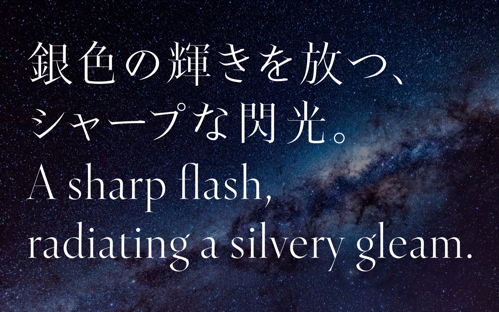
On the specimen, the serifs are as sharp as promised. Some details are a matter of taste: the tail of the y, for instance, looks a little light. But it follows the logic of a very fine contrast, so it reads as a choice rather than a slip.
However, long extenders and compact proportions come at a price: a small x-height. On the specimen, the Latin does look a little small next to the kana. In mixed lines, it may need a slight size boost to sit level with the Japanese.
Character set and practical use
Here the numbers matter. The standard version (StdN) covers 9,539 characters, based on Adobe-Japan1-3 plus custom glyphs, in OpenType for macOS and Windows 11. This is enough for most commercial and editorial work, and the "N" means it uses the 2004 JIS reference glyph shapes. However, it is far from the larger Adobe-Japan1 sets that many Japanese publishers now expect for proper names, place names and literary text. For a family that wants to replace Mincho, the gap is real. A rare kanji in someone's name will fall back to another font, and that is exactly where a sharp, distinctive design shows the seam.
On the screen side, TP Silver is available as a web font through Type Project's REALTYPE service. This is a good sign for a design whose sharpness will be judged on screens as much as on paper.

Limits
First, nobody is credited. The release names only the CEO and speaks of the foundry's design and engineering teams. For a family meant to carry a 25th anniversary, it is a pity not to know whose hand shaped the attack strokes.
Then, access. The English page offers only TP Connect, a subscription of 30,000 yen a year that covers the whole Type Project library. According to the foundry, it is available in Japanese only. The Japanese release says single purchases are possible, but no price is shown on the English page.
Finally, the specimen story is thin outside Japan. The PDF specimen is there, but there is no English text on how the kana changes from heading to body sizes or how to pair the family with Type Project's own gothics. For a release that wants to step out of its category, that context would help.
Verdict
TP Silver is a thoughtful idea, carried out with a clear system. It takes the reflexes of Song-style type while keeping a Mincho frame, divides seven weights into honest jobs, and gives the Latin a reason to belong. As a display serif for Japanese editorial design, packaging and identity, it is one of the more distinctive choices of the year.
Is it a full replacement for Mincho? Perhaps, for some uses. The character set may prove short for heavy publishing, and its extreme contrast will have to show what it can do at text sizes. In short: a Mincho with a blade, and well worth testing. Test it in your own layouts before you commit to it for a whole book.
Learn more: the features, the PDF specimen and the TP Connect subscription are on the Type Project website.