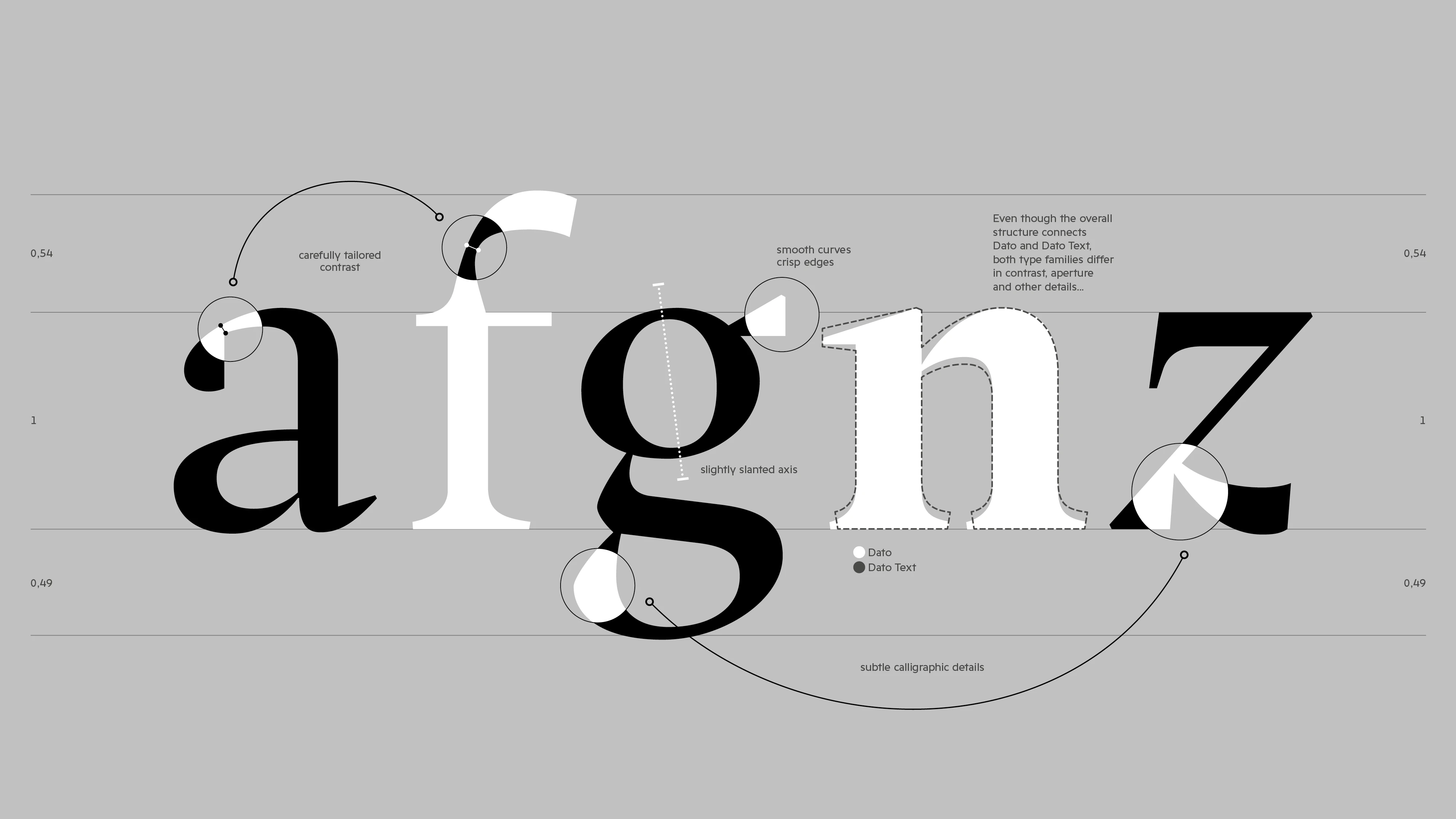
Some typefaces are launched. Others are finished. Dato belongs to the second group. Its foundry says it has been more than a decade in the making: first conceived at the Royal Academy of Art in The Hague, then completely reimagined twice before its release. That is a long time in a market that now ships new families every week. Patience, however, is not a quality in itself. A slow typeface can be a careful one, or simply a late one. And Dato enters the most crowded field in type design: the serif rooted in Renaissance printing. So the question is direct: in a field this crowded, does Dato's patient, two-size approach give it a real reason to exist?
Dato is designed by Daniel Perraudin and published in 2026 by Gallery Type, the Berlin foundry he founded. Font engineering is by Noe Blanco, and the visuals by Ceci Erlich. The project started as Perraudin's graduation work in the Type and Media class of 2012, then called Dato Serif. Fourteen years from student project to retail release is unusual. It also explains the tone of the launch, which promises a typeface "neither nostalgic nor driven by trends".
The skeleton: a Dutch education
Start with the roots. The foundry names two references: early Renaissance type, and the Dutch typographers Bram de Does and Gerrit Noordzij. Both names matter. Noordzij taught for decades at the Royal Academy in The Hague, and his book The Stroke argues that letters are built from the movement of the pen. In practice, that means the thick and thin parts of a letter follow the angle of a broad nib, not a ruler. De Does, for his part, drew Trinité and Lexicon, two book faces designed for long, serious reading.
So Dato is not a revival. It does not copy one historical font. It comes from a school of thought, in which a roman is drawn from the logic of writing and then disciplined for print. The specimen speaks of subtle calligraphic details, and the word subtle is important. This is a tradition that hides its pen behind good manners. Thus, the first impression of Dato will be calm rather than striking. That is a choice, not a weakness, but it does raise the bar: a calm serif has to win on rhythm and spacing, because it has no gimmick to fall back on.
The idea: two sizes, one character
The distinctive idea is the split into two optical sizes. Dato Text is made for small sizes, where the foundry promises balance, rhythm and clarity. Dato, without suffix, is made for larger settings, where it is meant to bring elegance and presence. The specimen says the two families share one overall structure but differ in contrast and aperture, among other details.
Those two terms deserve a word of explanation. Contrast is the difference between the thick and thin strokes. Aperture is how open the gaps are in letters such as c, e or a. At small sizes, thin strokes break up and narrow gaps fill in, especially on screens or cheap paper. At large sizes, the same robust drawing looks clumsy. An optical size solves this by drawing the same idea twice, each time for its real reading distance. Metal type did this size by size. Digital type is slowly relearning it.
Of course, two sizes are a minimum, not a luxury. The specimen does not give point-size ranges for the switch from Text to Display, nor does it quantify the differences between them. A designer will have to test both at real size before deciding where the line falls.
Function: the editorial kit
On paper, the toolkit is complete. Each optical size comes in four weights, Regular, Medium, Bold and ExtraBold, each with an italic: sixteen styles in total. Dato counts more than 1,100 glyphs. The OpenType features include true small caps and all small caps, case-sensitive punctuation for all-caps setting, standard and discretionary ligatures, and ordinals. The figures cover oldstyle, tabular, tabular oldstyle and small-cap versions, with numerators, denominators, and scientific superiors and inferiors.
Then come the extras. A stylistic set offers an alternative g. Others hold arrow and triangle variants, and two sets give circled and black circled figures. Small things, but exactly what captions, footnotes, signage or annual reports need. Thus, Dato is equipped for real documents, not only for specimens. The files come as OTF and WOFF2, with a variable version listed as OT Var and TTF on request. The specimen does not name the variable axes.
Languages
Language support is broad for a Latin family. The foundry lists well over a hundred languages, from Afrikaans and Basque to Yoruba and Zapotec, including Northern Sámi, both Sorbian languages, Māori, Pacific languages such as Samoan and Tuvaluan, and a long list of African languages. However, the materials mention no Greek and no Cyrillic, and Vietnamese is not on the list. For an international corporate client, that is worth checking early.
Use: where Dato fits
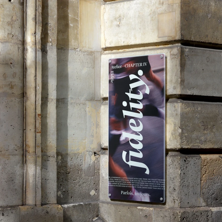
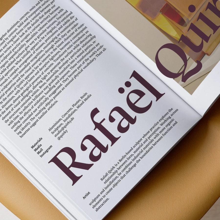
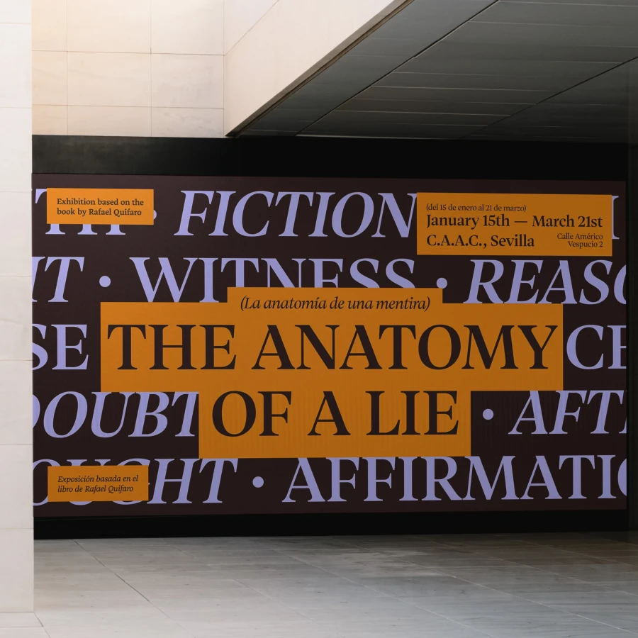
The foundry is clear about its targets: editorial and corporate typography, publications and brands. First, books and magazines. This is the natural home of a Renaissance-rooted text face with true small caps and oldstyle figures. Dato Text for the running text, Dato for titles and pull quotes: the pairing is built in, and no second family is needed. Second, institutions. The foundry's own images show museum banners and posters, and a cultural brand with a long horizon fits the foundry's promise of a typeface for people who think in decades rather than campaigns. Third, premium consumer brands, where a classical serif signals craft without the stiffness of a high-contrast fashion face.
The licensing model deserves a mention too. Gallery Type sells one perpetual license covering print, one web domain, social media and apps, priced by the client's number of employees and adjusted by country. Variable fonts are included with a full family purchase, and the trial fonts are fully functional for testing and pitching. For small studios and smaller countries, that is fair.
Limits
Is it perfect? No. The first limit is range. Four weights, starting at Regular, is lean for a family that wants to serve brands. There is no Light or Book for large, refined headlines, and no Black beyond ExtraBold. The second limit concerns the italic. The 2012 graduation project described two italics: a "normal" one and an upright italic for a more expressive flavour. The released specimen lists one italic per weight. Perhaps that was the right edit, but the most original idea of the student version seems to have stayed behind.
Finally, there is the field itself. Dato competes with decades of excellent Dutch-school text faces. Its quiet design is honest, but quiet designs need to be seen in use, at length, before anyone can judge them. The foundry's specimen shows the family well. It cannot show a three-hundred-page book.
Verdict
Dato earns its place, but not by surprise. Its reason to exist is consistency: a properly split text and display pair, a complete editorial feature set and a fair license, all drawn from one coherent tradition. Its weaknesses are a narrow weight range, unclear optical-size boundaries, and an italic less adventurous than its origins promised. For publishers and institutions who want a long-term serif, it deserves a serious trial. For brands chasing a strong first impression, it is probably too discreet.
Learn more: the full family, the trial fonts and the PDF specimen are on the Gallery Type website.