Type specimens love musical metaphors. Rhythm, colour, tempo: the vocabulary of music has long been borrowed to describe what happens between letters. Few typefaces, however, take the metaphor as literally as Cymbal. Its specimen is laid out like a score, its styles carry names that read like mixing-desk settings, and its foundry promises that it "makes you want to dance". Marketing, of course. But behind the tone there is a genuinely unusual idea, and the question is a simple one: is Cymbal's tuning system a real design tool, or a clever party trick?
Cymbal is designed by Linus Knappe and published in 2026 by Nice To Type, the foundry run by Gabriel Richter. Spacing and kerning are by Igino Marini, and quality assurance by Christoph Koeberlin and Gabriel Richter. That credit list alone says something: this is not a weekend experiment but a family built with the production standards of a retail workhorse.
A grotesk with two volume knobs
Start with the skeleton. The foundry describes a design that "swings between open dynamics and linear coolness", influenced at the same time by humanism and by the old grotesques. In practice, that means a sans with a steady stroke and a calm construction, but with diagonal terminals that keep it from going stiff, even on letters such as V and W, where most grotesks would simply cut straight. Thus, the texture stays lively without becoming quirky. So far, so good, but not yet remarkable.
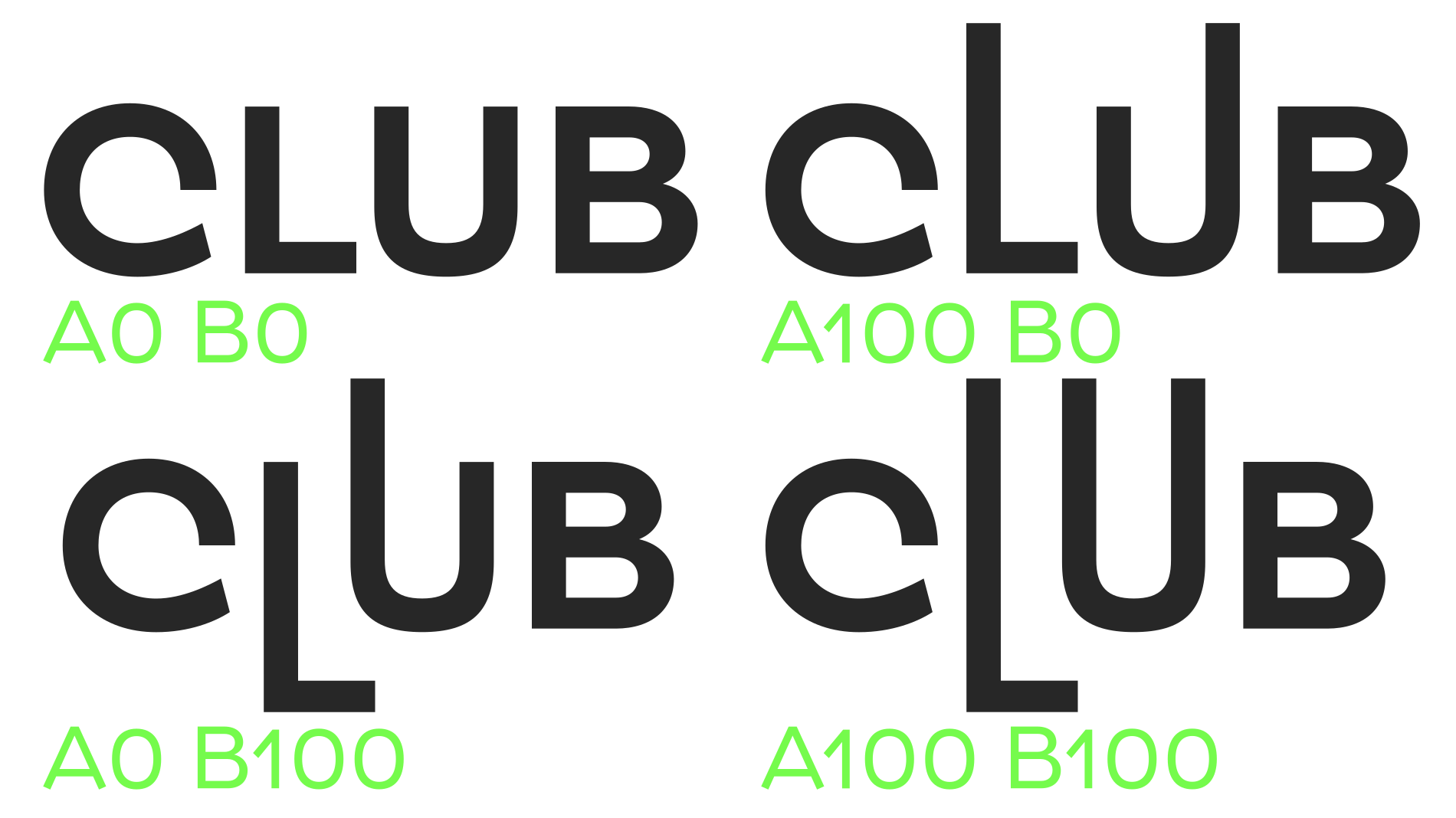
The remarkable part is elsewhere. Cymbal has two extra axes, called Amplitude A and Amplitude B, which change the length of the extenders: the parts of the letters that rise above or drop below the x-height. In the variable font, you get three axes in total, weight (wght), AMPA and AMPB, and you can dial each one to taste. Push the amplitudes up and the ascenders shoot upward, the descenders reach further down, and the word suddenly takes on a different silhouette. Pull them down and the letters close in on the x-height, compact and blocky.
Indeed, this is where the musical metaphor stops being decoration. The same word, set in the same weight, can look calm or loud depending on two settings. For a logotype, this is a real gift: you can adjust a single letter's height to lock a word into a shape, without redrawing anything and without leaving the family.
The pre-mixed problem
Of course, not everyone works with variable fonts. Many designers still live in static files, and many brand systems require them. Nice To Type's answer is pragmatic: the static cuts come "pre-mixed". Each of the six weights, from Light to Heavy, is available in a series of fixed blends of the two amplitudes, at 0, 25, 50 and 100. The result is 96 static styles, with names such as Cymbal Semi Bold A25 B0 or Cymbal Regular A50 B50.
Commercially, the offer is generous: buying one static weight gets you all fifteen pre-mixed styles at that weight. However, this is also where the system shows its limits. Ninety-six styles in a font menu is a lot to scroll through, and names like "A100 B25" mean nothing to a client, an intern or a production studio receiving the files. A brand that adopts Cymbal will need to write down precisely which blend is the logo, which is the headline and which is the text, otherwise the identity will drift from one document to the next. The tool is precise. The workflow around it will have to be just as precise.
Function: the everyday kit
A display idea can hide a weak text face. Not here, at least on paper. Cymbal comes with the features expected from a family meant for daily use: tabular figures, superscript and subscript figures, custom fractions and case-sensitive forms. On top of that, eight stylistic sets offer alternate forms. Thus, the family is not limited to logos and posters. A price list, a programme or a timetable can be set in Cymbal without switching to a companion sans.
There is also a detail that speaks directly to fellow type designers: Nice To Type ships its fonts with a structured glyph order and special "preglyphs", visible when you switch the glyph view from Unicode to CID/GID. It is a small courtesy, but it shows a foundry that thinks about the people who will open its files, not only about the people who will look at them.
Languages
Language support is broad for a Latin family of this kind. The foundry's list runs from Afrikaans to Zulu and includes the Sámi languages, a long list of African languages such as Kinyarwanda, Swahili, Xhosa and Zulu, and Pacific languages such as Samoan, Tongan and Tok Pisin. Of course, coverage is not the same as quality, and only real-world setting will tell how the amplitude axes behave with stacked diacritics. However, the starting point is serious.
Use: where Cymbal fits
So where does it belong? First, in identities. The amplitude axes are designed for exactly the moment a designer usually reaches for the pen tool to stretch an ascender by hand. Here, the adjustment is part of the font, consistent across every weight, and reversible. Second, in music, culture and event branding, where the foundry's own playful specimen points. A festival can keep one typeface and still give each stage or each night its own silhouette. Third, in motion design: the variable axes animate smoothly, so a word can "breathe" on screen without any trick.
In running text, the case is less obvious. The regular blends should behave like a well-made humanist-leaning grotesk, and the professional spacing helps. However, the system's whole point is to be seen. In a long paragraph, nobody will notice that the ascenders are set to 25 rather than 50. The amplitudes are a display tool first.
Limits
Is it perfect? No. The first limit is practical: the system demands discipline. Variable axes and 96 named blends are wonderful in the hands of a type director, and confusing in the hands of everyone else. The second limit is that the foundry page presents the family in upright styles only. For an editorial project that needs italics for emphasis, titles or quotations, that is a real gap, and buyers should check before committing.
Finally, there is a risk in the idea itself. Typefaces built around an effect can age quickly when the effect becomes fashionable. Cymbal avoids the worst of this by keeping its base design sober: at zero amplitude, it is simply a good grotesk. The trick is optional. That is precisely what saves it.
Verdict
Cymbal is more than a party trick. Its amplitude axes solve a real problem, the hand-stretched ascender in a logotype, and they solve it inside a properly engineered family, with serious spacing, everyday OpenType features and broad language support. Its weaknesses are on the workflow side: a crowded style menu, cryptic blend names, and no italics shown on the foundry page. For identity and event designers, it is one of the most interesting new tools of the year. For long-form editorial work, look elsewhere, or use it only for the headlines.
Learn more: the full family, the type tester, trials and the specimen are on the Nice To Type website.